
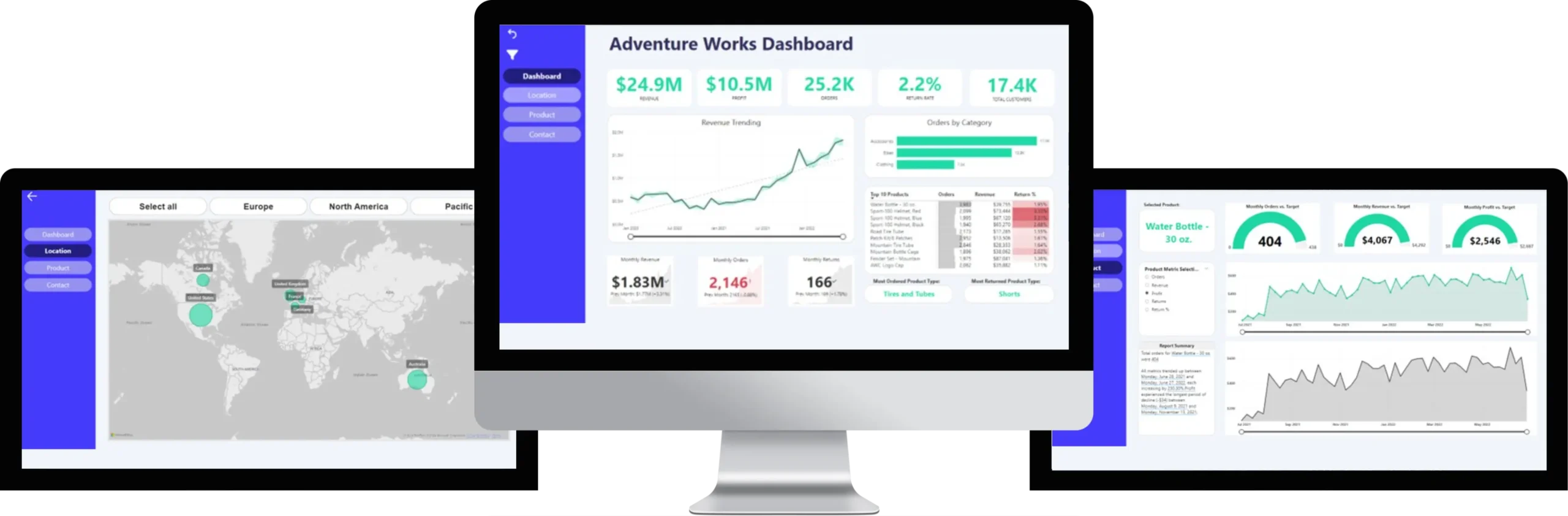
The current Adventure Works Dashboard, while providing a wealth of information, suffers from several key issues. Firstly, the dashboard lacks a clear, focused narrative and a prioritized set of key performance indicators (KPIs). The abundance of data and visualizations can be overwhelming for users, making it difficult to quickly identify and understand the most critical business trends and insights. Secondly, the design lacks visual consistency, with varying chart types, colors, and formatting throughout, which can hinder data interpretation and make it difficult to quickly compare and contrast different metrics. Thirdly, the dashboard appears to be static, offering limited interactivity. Users are unable to easily filter data, drill down into specific segments, or explore different scenarios, limiting their ability to gain deeper insights and answer specific business questions.

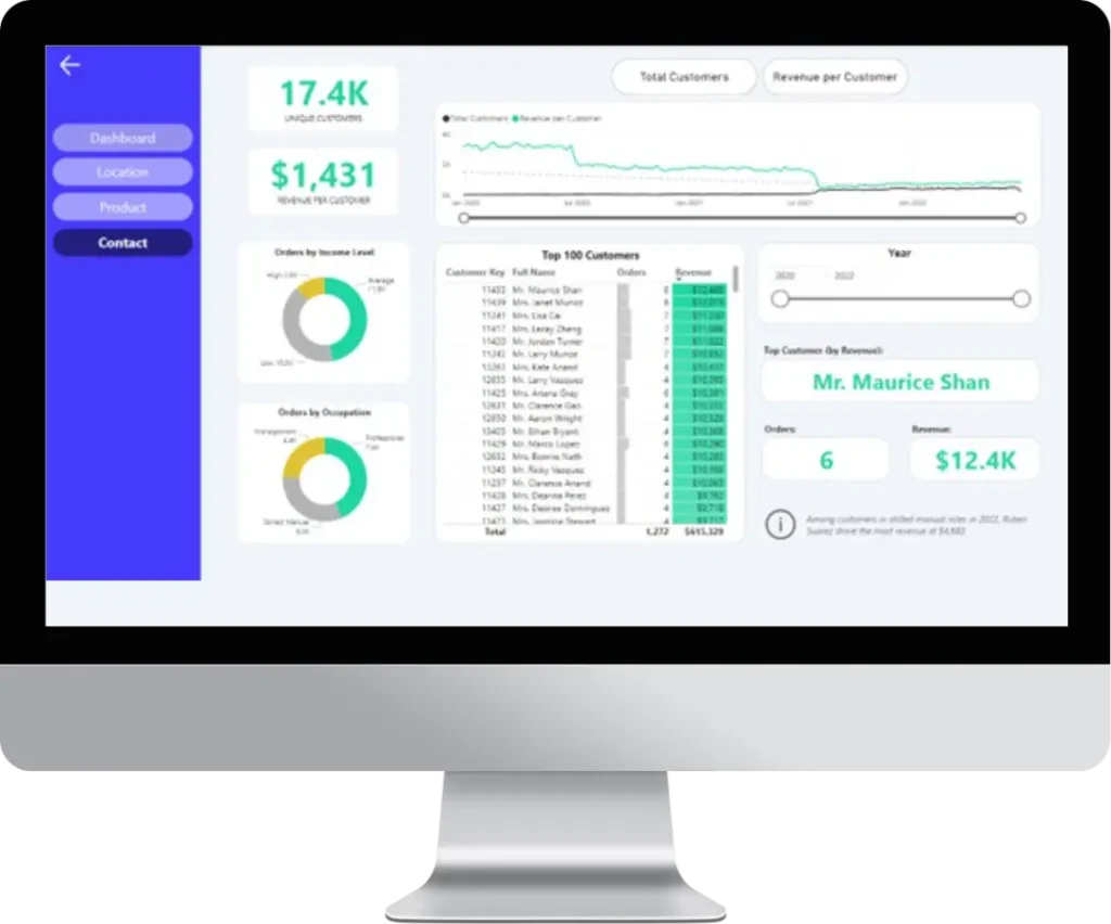
To address the current limitations of the dashboard, a significant redesign is necessary. First and foremost, the dashboard should prioritize and clearly communicate key performance indicators (KPIs) such as overall revenue, profit margin, sales growth, and customer churn. These KPIs should be prominently showcased using clear and concise visualizations like large, well-labeled gauges or bar charts. Secondly, improving visual consistency is crucial. This involves establishing a consistent color palette and applying it throughout the dashboard, along with using a consistent chart style and formatting for all visualizations. Simplifying the layout will also enhance readability and create a more organized and visually appealing presentation. Finally, enhancing interactivity is key. Implementing filters and slicers, enabling drill-down capabilities, and adding interactive elements like tooltips will empower users to explore data at different levels, uncover deeper insights, and make more informed decisions.
If you want to get a free consultation without any obligations, fill in the form below and we’ll get in touch with you.
