Chocolate Sales Dashboard

About the project

About the project

This dashboard is designed for a chocolate manufacturing company to monitor and analyze key business metrics related to sales, profits, and product performance. Visualization aids in identifying trends, assessing the effectiveness of sales strategies, and determining areas for improvement.

Industry

Country

Technologies

Built For

Problem

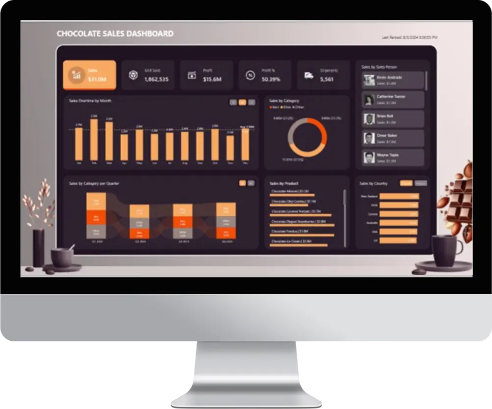
The current Chocolate Sales Dashboard, while displaying a wealth of sales-related information, suffers from several key issues. Firstly, it suffers from information overload, presenting numerous metrics and visualizations that can overwhelm the user and hinder quick comprehension of key insights. Secondly, the dashboard lacks a clear focus on the most critical KPIs for the business, making it difficult to identify and track the most important performance indicators. Thirdly, the visual inconsistency across the dashboard, with varying chart types and color schemes, further complicates data interpretation. Finally, the static nature of the dashboard limits user interactivity, preventing deeper exploration of the data and hindering the ability to uncover hidden trends or patterns.

Solution

To improve the Chocolate Sales Dashboard, we need to prioritize identifying and focusing on key performance indicators (KPIs). Streamlining the dashboard by reducing visualizations and metrics will prevent information overload. Establishing a consistent visual style with a unified color palette and chart types will enhance readability and data interpretation. Finally, incorporating interactive features like filters and drill-down capabilities will empower users to explore the data more deeply. While a storytelling approach can be valuable, it should be considered after addressing these core issues.

Enquire Now

If you want to get a free consultation without any obligations, fill in the form below and we’ll get in touch with you.

Note: If you are looking for Job or Internship, please click here>>>>>